Brand Journeys
When collaborating with brands, it's essential to grasp their journey, their current position, and most importantly their future aspirations. The ultimate aim is to cultivate a robust partnership where together, we work towards elevating the brand's presence and impact.
Edward Jones
Edward Jones is a renowned financial services firm, known for its personalized approach to wealth management and investment advisory services. They offer tailored financial strategies to individuals, families, and businesses. Their most valuable service is their network of financial advisors who provide personalized guidance and comprehensive solutions to help clients achieve their financial goals, ranging from retirement planning to wealth accumulation and preservation.
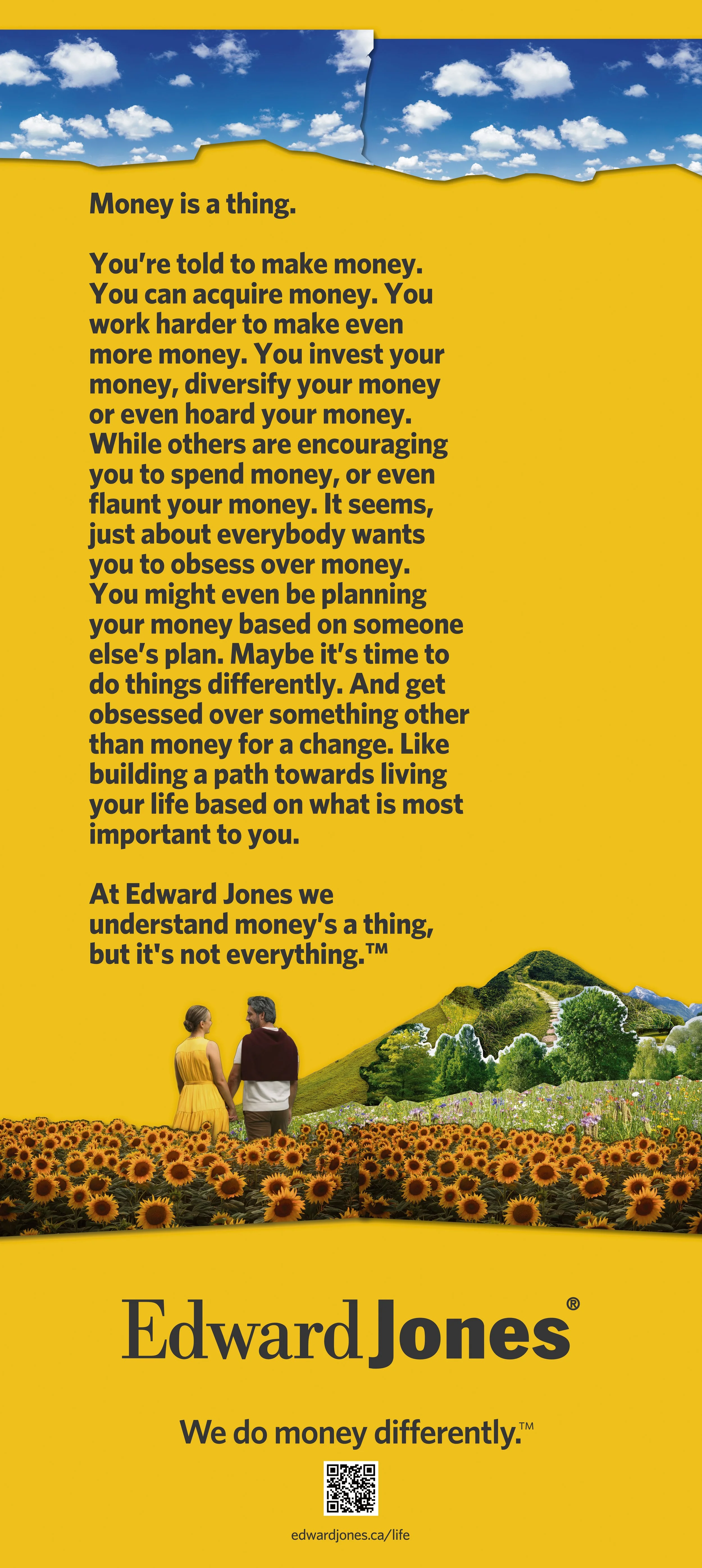
Focusing on their one-of-a-kind service offering, I collaborated closely with Mass Minority and Edward Jones to craft compelling content for their paid digital campaigns. These 360 campaigns were art directed and designed to resonate across various platforms, including Instagram, Facebook, Linked In, Google Display Network (GDN), and Amazon Advertising. Adapting to the diverse specifications of each platform, the content ranged from dynamic 30-second clips to optimized static images, ensuring maximum impact and engagement.
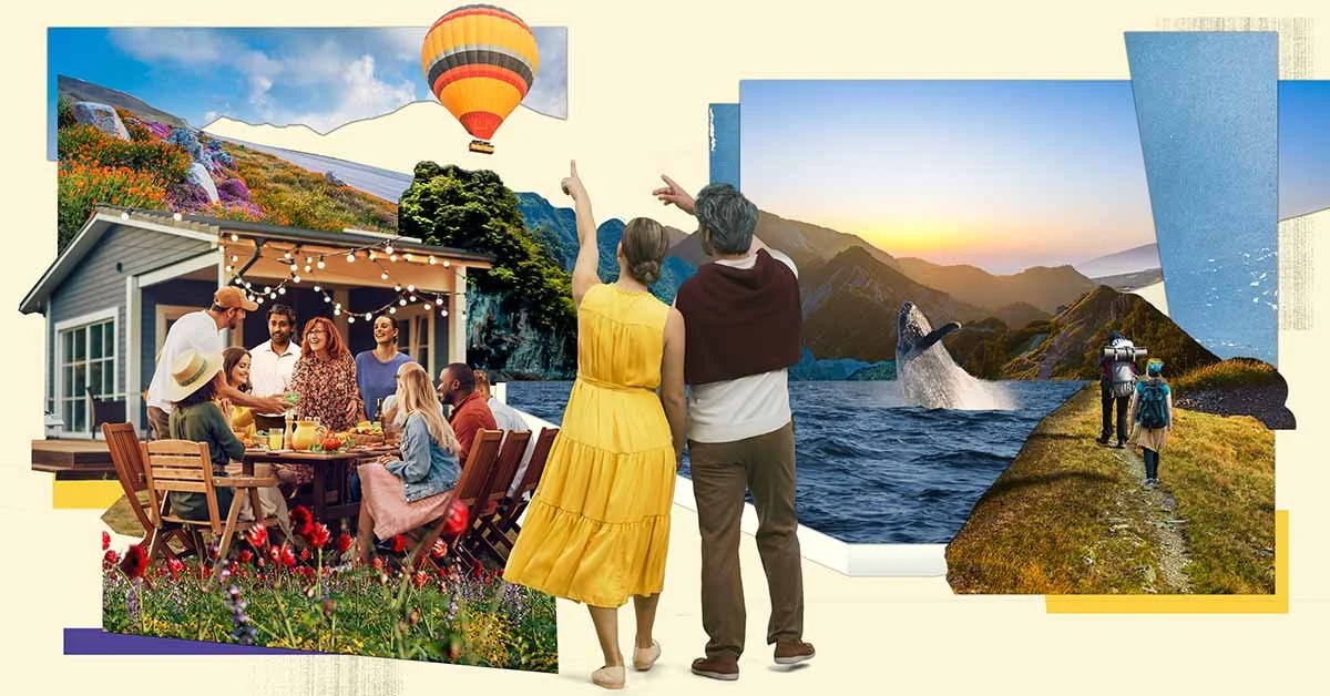
In a recent collaboration, I had the privilege of working alongside the esteemed international artist, Mark Murphy, to create a unique TV spot for Edward Jones. Murphy's captivating visual storytelling, brought to life through an animated collage, provided a unique narrative backdrop. Leveraging his artwork, I adapted the content to suit the specifications for every platform, including a full page print in the Globe and Mail, ensuring a consistent and compelling presence across the board.
Party City Holdco Inc.
As we all know - Party City is the one-stop destination for all things party-related! It offers a variety of decorations, costumes, balloons, tableware, and more. Catering to every celebration you can think of, from birthdays and weddings to holidays and themed events. If you want a Barbie themed party…I assure you they have everything you need to make it a reality!
I had the privilege of collaborating with a dynamic team: Mass Minority, who are dedicated to crafting Party City's primary digital content. This encompassed creating engaging paid social media campaigns for platforms like Instagram, Facebook, and Pinterest, developing compelling assets for their website, micro-sites and web banners, as well as designing email layouts for their expansive subscriber base. To maintain brand coherence, we established comprehensive brand guidelines and adaptable templates, regularly refining them to spotlight key celebrations targeted for promotion. Leveraging the imagery from Party City's in-house studios, we crafted a diverse range of static assets, animated clips, and GIFs tailored for seamless integration across all digital channels. Notably, I spearheaded the redesign of their latest email template in line with UI best practices, which debuted successfully in Q1 of 2024.
The exceptional calibre of our team's work not only bolstered Party City's brand presence but also opened doors to collaboration with their affiliated companies, such as Anagram. In this capacity, I played a crucial role in rejuvenating their email template for B2B sales, further amplifying our impact within the industry.
Covid Vaccine Facts (CVF)
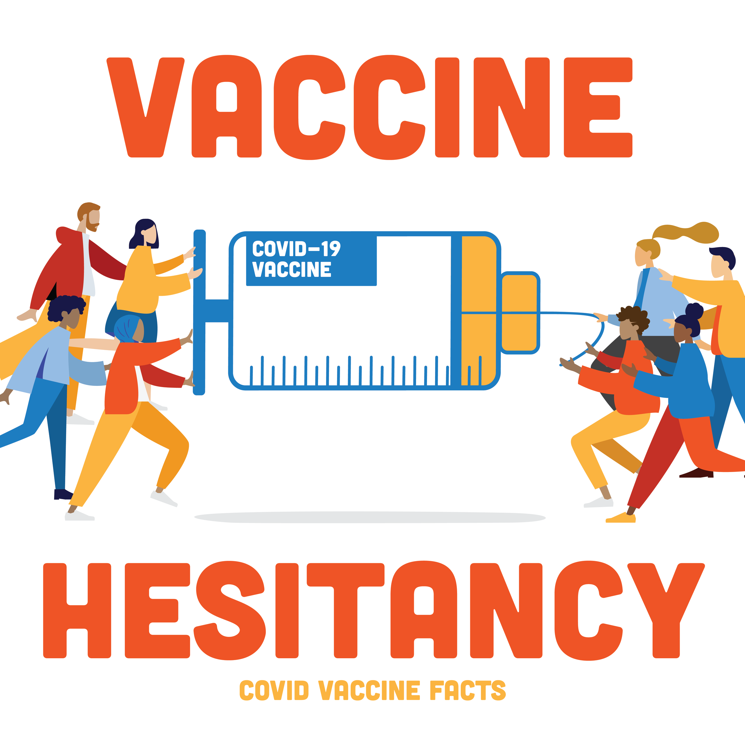
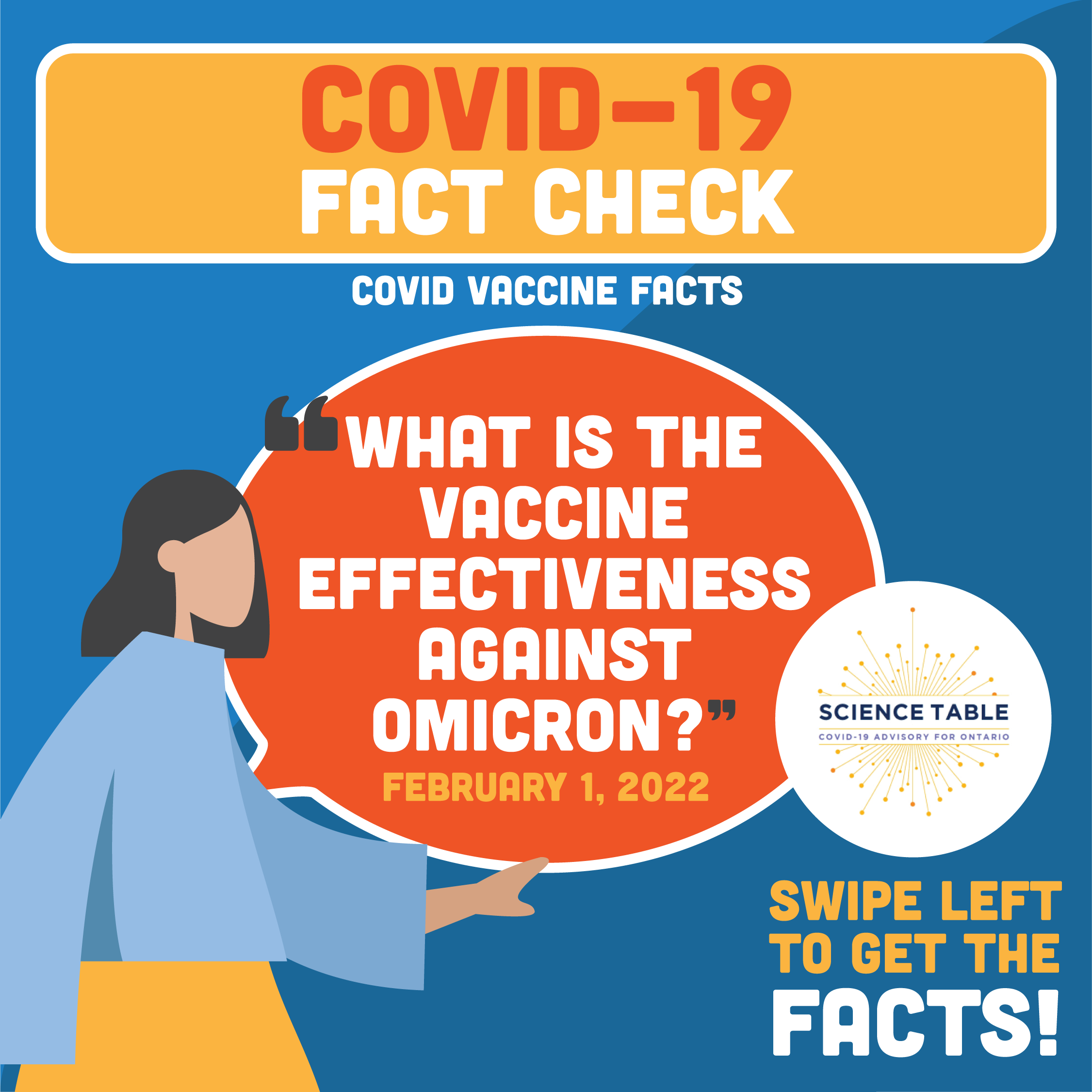
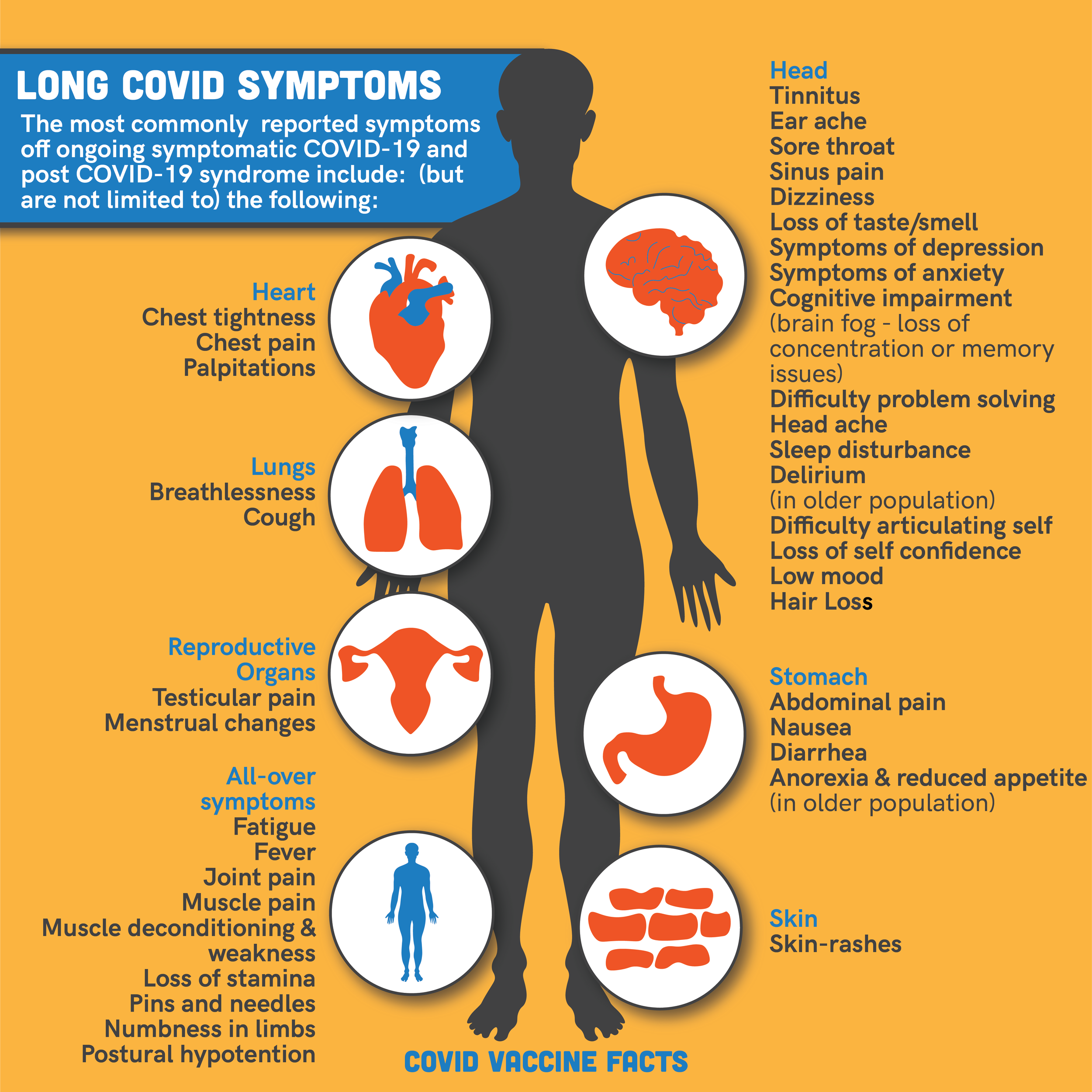
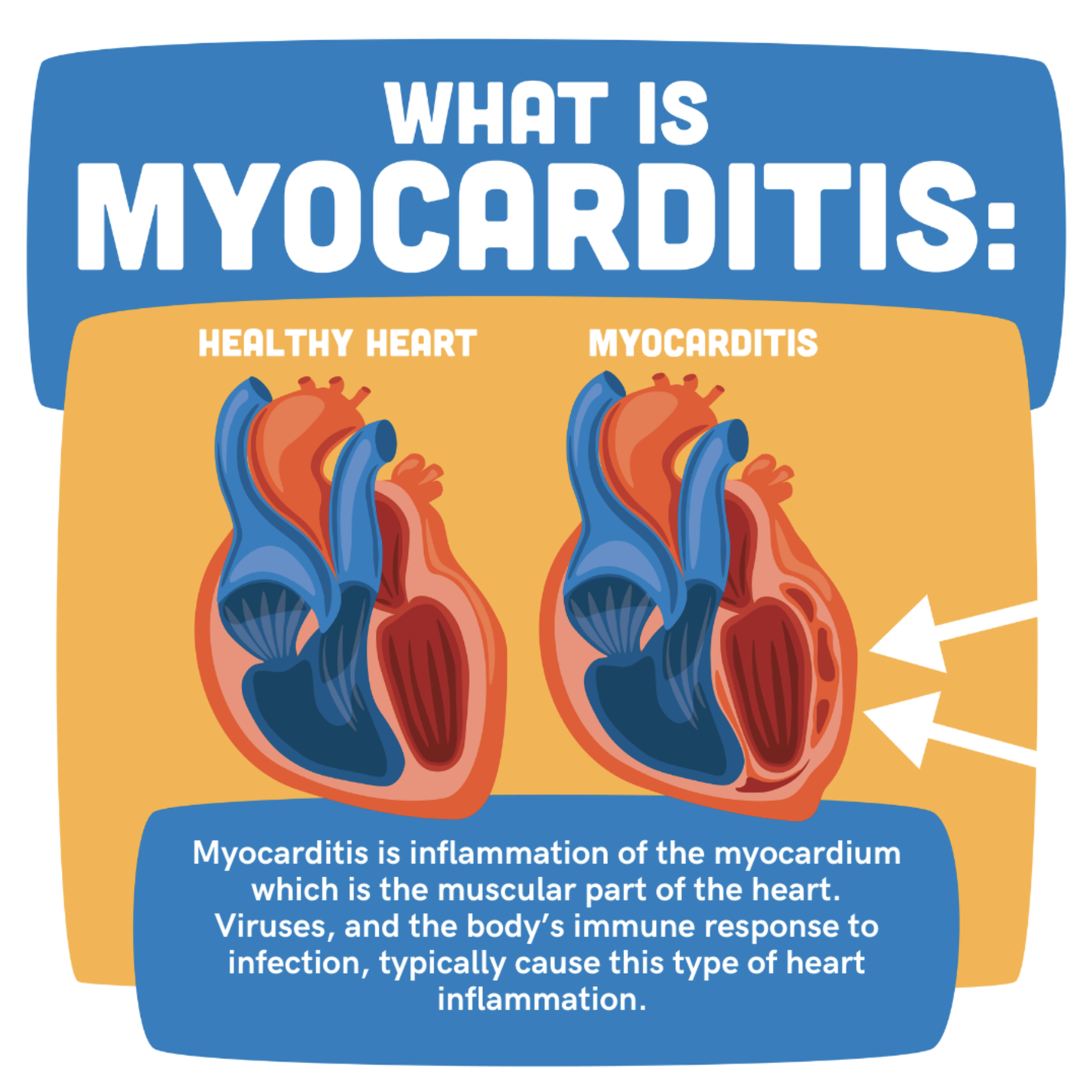
CVF, an online educational platform tailored for Canadians seeking reliable information about Covid vaccines, emerged from the collective efforts of dedicated physicians. With a commitment to deliver timely and medically substantiated insights, CVF focused on a multifaceted approach, incorporating info-graphics, illustrations, animations, and interviews with esteemed medical professionals nationwide.
In collaboration with the outstanding SA Creative Agency, our objective was clear: to create a visually compelling brand that seamlessly merges informative content with accessibility and recognition. Embracing bold hues, distinctive graphics, and intuitive animations, we established CVF as an impactful resource for those eager to expand their knowledge.
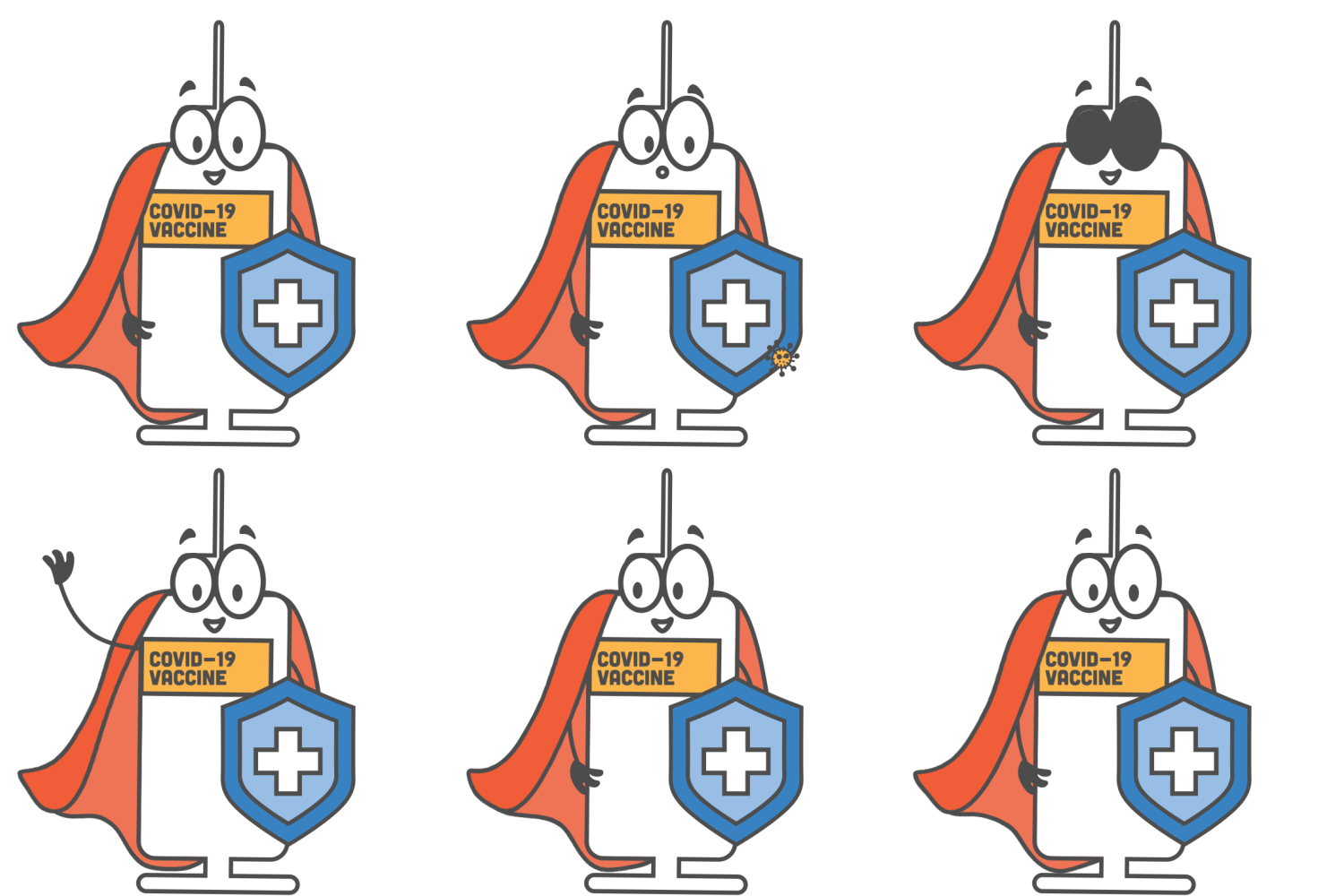
Integral to our strategy was the creation of Max the Vax, CVF's endearing mascot. Serving as both a relatable guide and the voice of the platform, Max enhanced the learning experience, particularly for younger audiences. Furthermore, Max became more than just a character; he transformed into a tangible takeaway sticker distributed to children who received the vaccination.
The resounding success of CVF garnered recognition, earning a feature in The Best Healthcare Designs by DesignRush, a reputable platform known for sharing exemplary design practices. Read the article here.
UREEQA
UREEQA is an organization dedicated to empowering creators by safeguarding and authenticating their creations, fostering more equitable outcomes in our digital landscape.
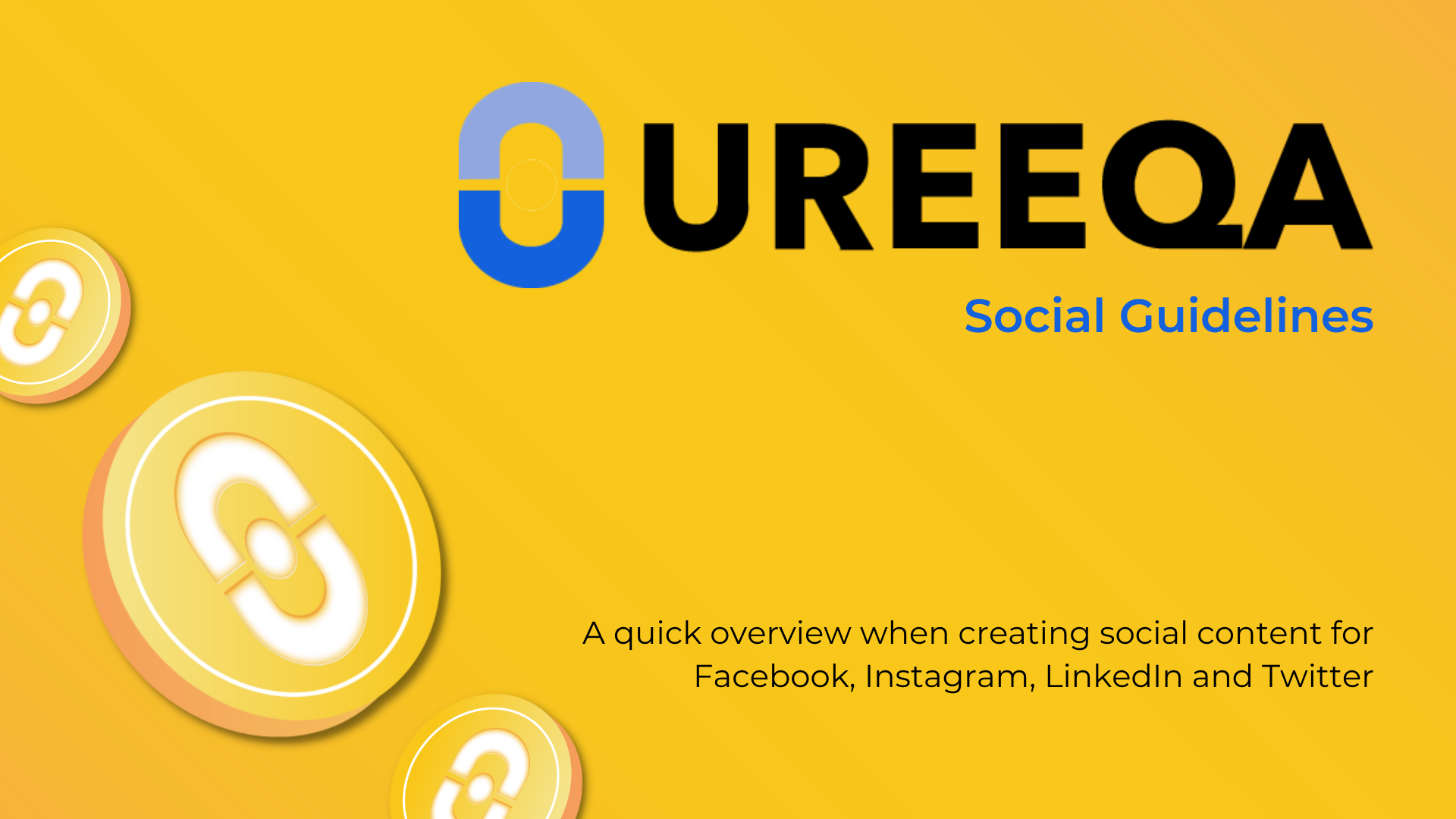
My responsibilities encompassed adapting and integrating primary illustrations crafted for UREEQA into their marketing materials, guaranteeing harmony with the brand's overarching vision. Using these illustrations as a central element, I designed brand guidelines to maintain uniformity in brand identity across all platforms. These guidelines were important when creating their diverse assets such as white papers, visual aids, and social media templates, fostering a seamless and influential brand presence across all channels.
Oakville Performance and Wellness
Oakville Performance & Wellness embodies a straightforward ethos: Move well. Live well.™. Their approach centers on cultivating functional movement patterns through proper exercise progressions, ultimately enhancing overall performance. With a stellar team of professionals, OakPW tailors their methods to foster optimal movement for each and every client.
My collaboration with OakPW started with the request to create icons for their online habit tracking application, a tool was used to boost adherence and monitor participation from their clients. Understanding their need for more engagement, I was tasked to bolster their online presence. Beginning with social content development, I delved into researching their target audience, crafting personas based on existing clients. Understanding OakPW's aspiration to foster a healthier relationship between clients and their bodies, we established a tone that resonated as experienced, focused, and empowering. Remaining faithful to this tone, we created templates and guidelines to cultivate a recognizable and trusted brand identity. This framework facilitated the creation of social media posts featuring educational insights and practical tips for leading a healthier lifestyle. Building on the success of this refreshed aesthetic, we embarked on redesigning and launching their website, ensuring a cohesive and impactful online presence aligned with OakPW’s values and mission.
Reya
Reya is an innovative online service dedicated to supporting individuals throughout their journey with birth control options. With a commitment to personalized care, Reya offers tailored solutions to ensure the right choice for each individual's unique needs.
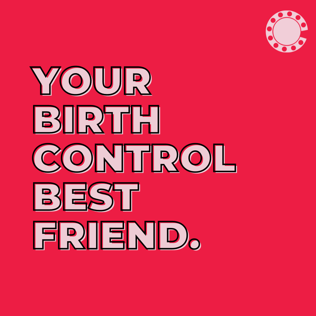
In collaboration with SA Creative Agency again, our primary focus was to revitalize Reya's brand identity. By delving into the intricacies of their target demographics and crafting detailed customer personas, we recognized the significance of being personal, playful, and private. Drawing upon these insights, we repositioned Reya as the ultimate "Birth Control Best Friend."
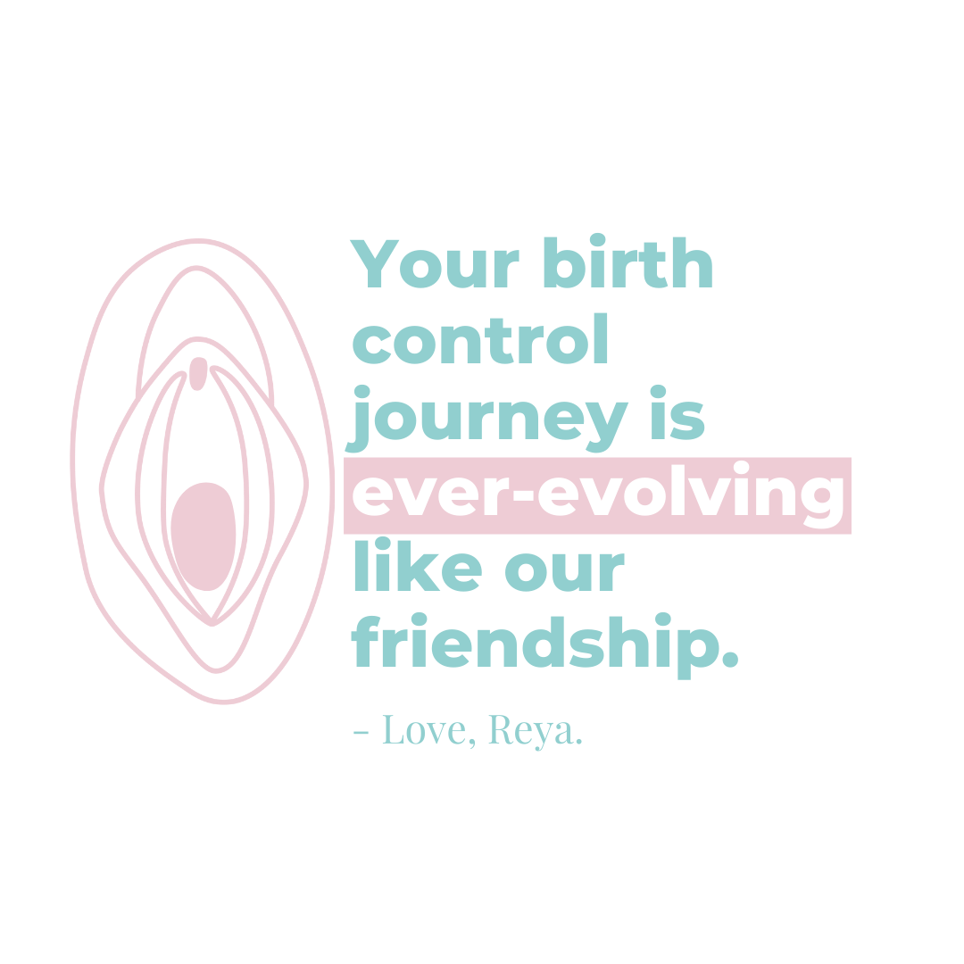
This newfound identity paved the way for us to explore vibrant colors, captivating illustrations, and resonant messaging, reshaping the brand's tone and fostering more meaningful connections with its audience. Through this strategic rebranding, we aimed to create content that not only informs but also empowers and engages individuals on their birth control journey.
Sloone: Hardwood
Sloone is a visionary company dedicated to elevating health and wellness through premium natural ingredients. Founded by three dynamic sisters, their mission is to craft a brand that exudes sophistication, confidence, and modernity.
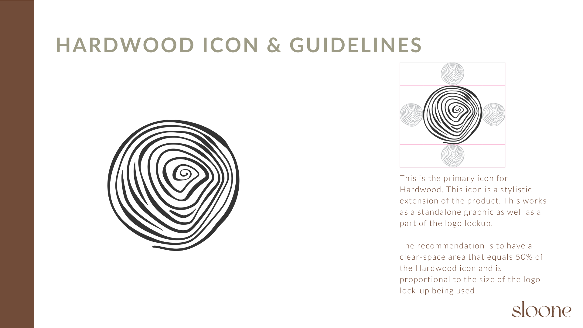
My collaboration with Sloone began with many in-depth sessions to grasp the essence of their products, progressing from initial sketches to refined concepts, and finishing with a polished brand logo. This collaborative process resulted in a gratifying final design. Building on this foundation, we developed brand guidelines, choosing optimal colours, fonts, and tones to encapsulate the brand's identity.
As the launch date approaches, our focus has shifted to packaging design, navigating the intricacies of product labelling to ensure compliance and consumer appeal. Simultaneously, we're immersed in creating compelling launch materials tailored for social media platforms, aimed at bolstering engagement and driving sales. This includes crafting branded static and animated templates for in-feed and story content, encouraging brand consistency and resonance across digital channels.
